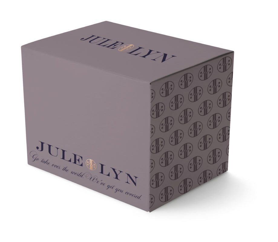
Entrepreneur Jule Lyn came to us with a genius idea and an empowering cause to match. She’s launching a new subscription business we know is going to be a hit: cute underwear, delivered monthly, right to your door. Even better? Her business is dedicated to supporting organizations that empower women. We think that’s pretty awesome.
For Jule Lyn’s logo and brand identity, we opted for a refreshingly rich-hued color palette. Mauve, deep magenta, and a rich navy take center stage in a logo that combines bold structured type with a feminine script. An iconic graphic is the finishing piece for this brand design: we manipulated the J and L from the primary typography into a simple, versatile icon. This icon will be ideal for brand longevity. As a compact version of the primary logo, it can be applied to tiny underwear tags, packaging stickers, and stamps.


We love how perfectly the branded pattern tied into the box design – and how it will eventually be used in additional items to help create and even more cohesive brand identity. Here’s another look at the custom package design in other variations of the brand color palette:

Keep an eye out for Jule Lyn’s subscription business, hitting the market soon! What’s not to love about a brand that delivers every month, and uses the profit to empower women around the world?
