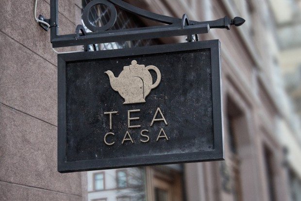
Clean, and crisp design was key for Tea Casa’s new brand identity, a look that speaks to the organic simplicity of a fresh cup of tea. The logo design captures the company name in an easily readable (clever) graphic, paired with a clean sans serif font. An all-neutral color palette and plenty of white space keeps this brand looking fresh. We loved the tagline: tea casa es su casa, so much that we made it a constant design element across Tea Casa’s branding, from business cards to package design! Take a look at the new designs, and if you’re in the Dallas, Ft. Worth area, be sure to stop by for a cup!


