Bakery Brand Design
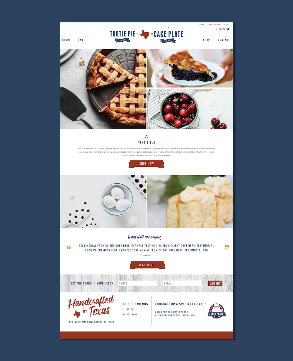
When two brands merge, one of the most difficult things to do (from a branding perspective) is to bring together the two identities, retaining what’s become recognizable and editing out what is not – to something that can stand alone and equally represent the two brands. Over the years we’ve loved working with Austin bakery, The Cake Plate, so when they told us about their news of a merger, we were so excited for what that meant to their ever-growing business. We were also super excited to hear about the other half of the merger, Tootie Pie, who we would have the privilege of working with as well. Tootie Pie had a strong patriotic color palette and Texan pride written all over it – while The Cake Plate had a bold brightly colored logo design – that was recognizable from a distance – but wasn’t at all aligned with the other. So we pulled from both – retained certain elements and created the individual brand marks for both (since both would still need the ability to stand alone), as well as a “joint” brand for the two when used together. Take a look at the beginning steps towards creating a unified look for these two successful Bakery Brands.
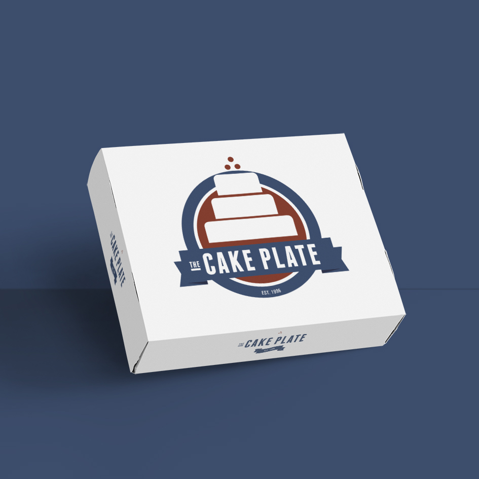
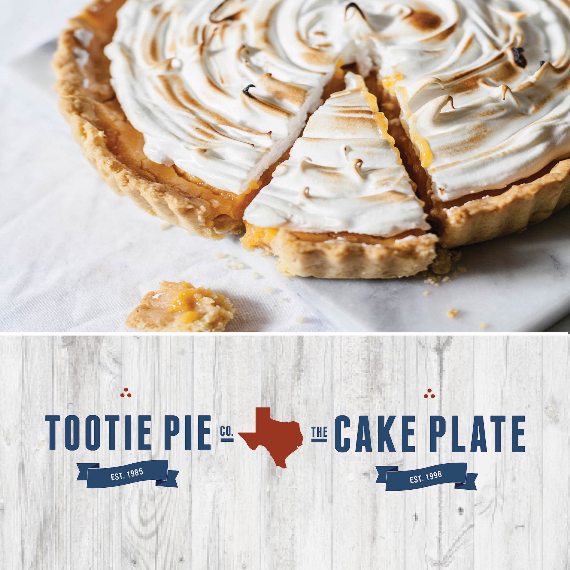
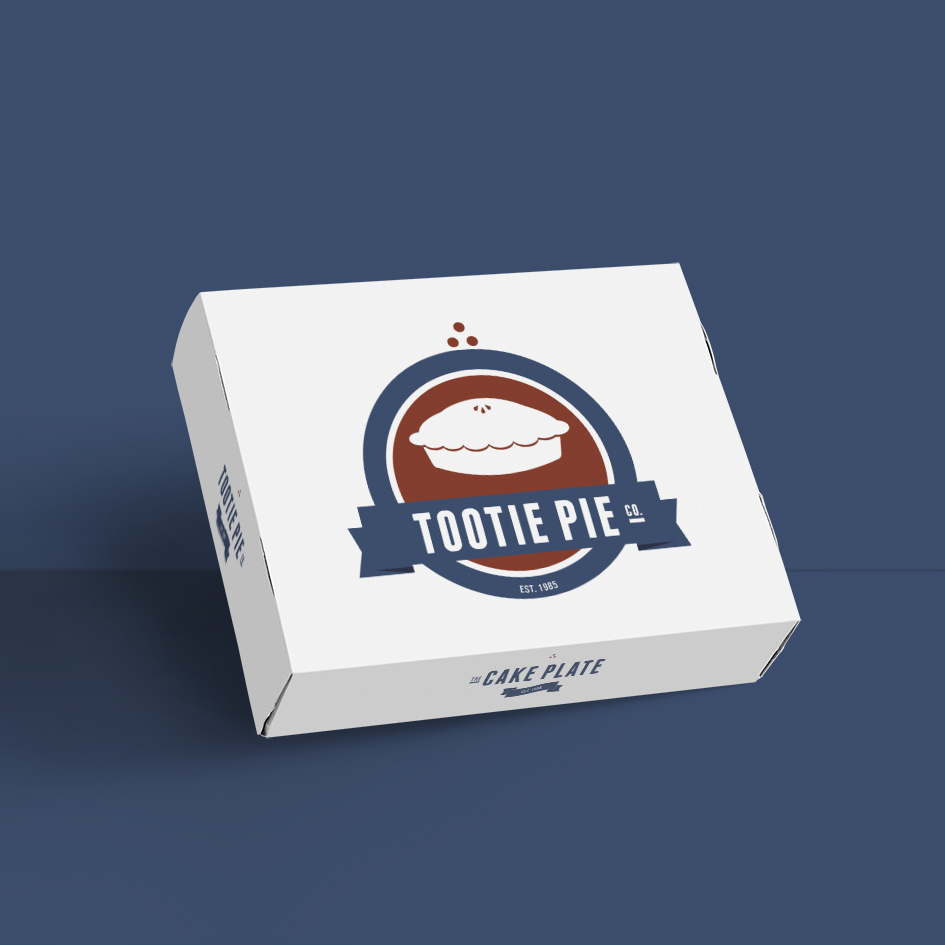
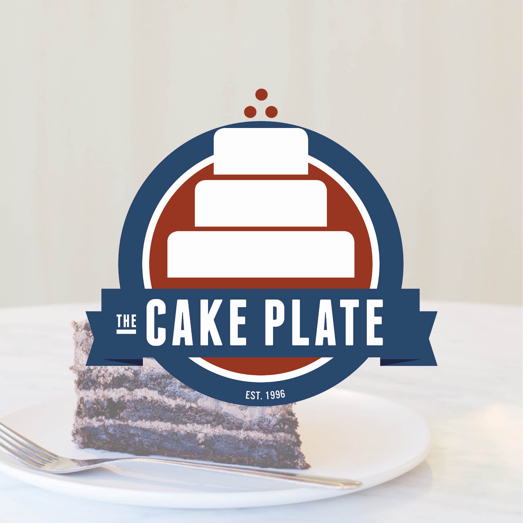
Tootie Pie wanted a logo for their pie and cake service, so we did just that for them! Whether they are sending a cake or a pie for an order, they will be able to use the box for that specific preference. This elevates their service to the next level, visually, while still keeping it simple.
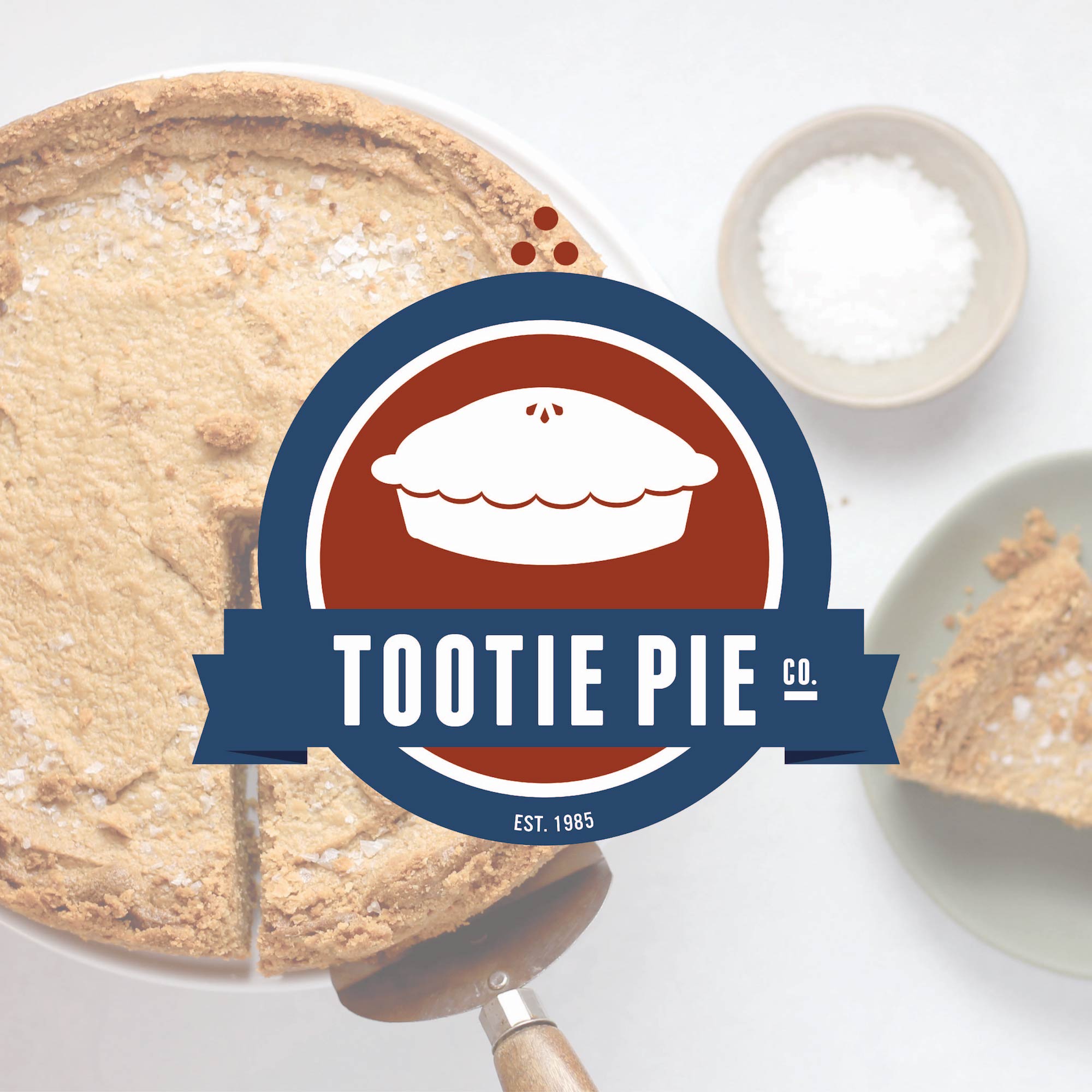
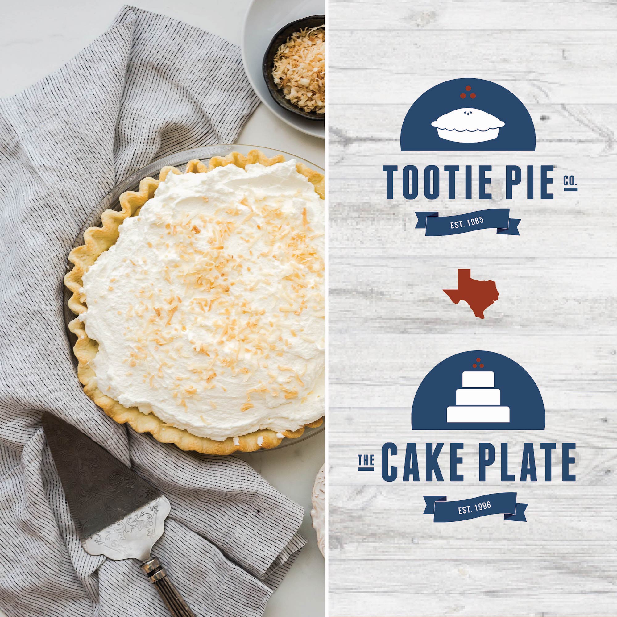
With such bold choices of font and thick lines, they will be able to place their logo on any background! Whether it be a picture of their chocolate cake or a coconut pie, the logos that we have created will always stand out.
Want to learn more about creating a recognizable brand for your bakery? We would love to show you what we can do, and talk to you about your next project.